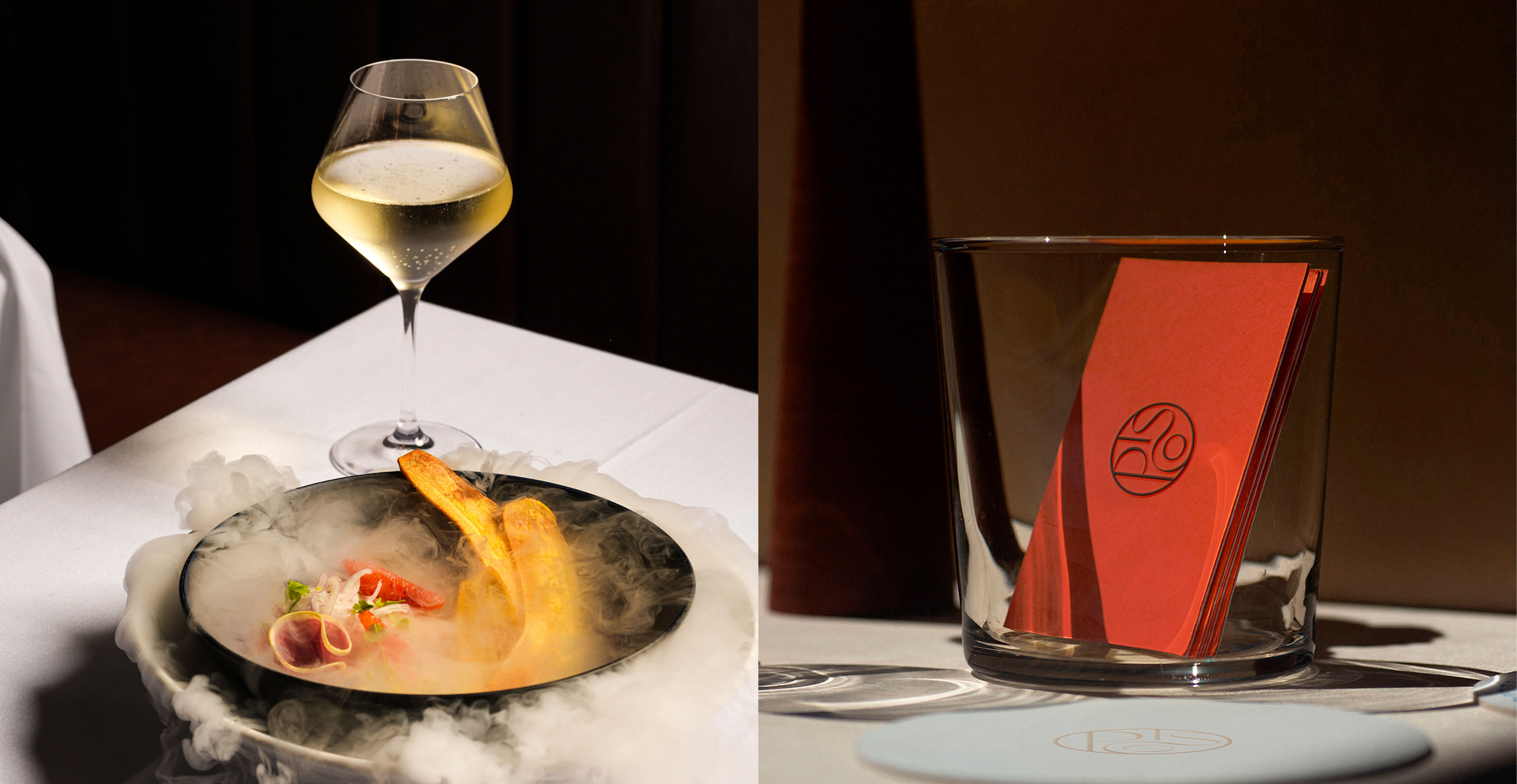
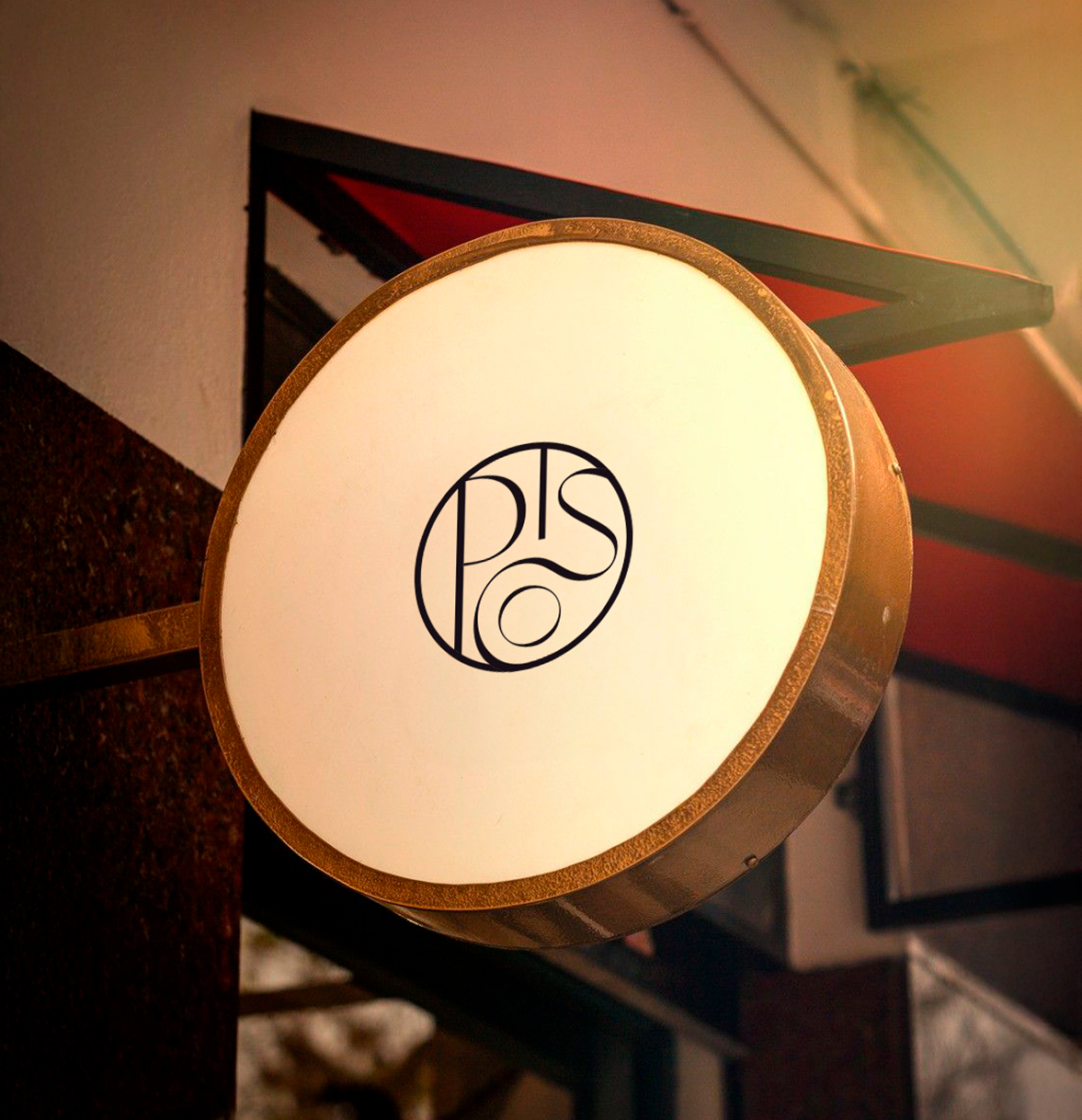
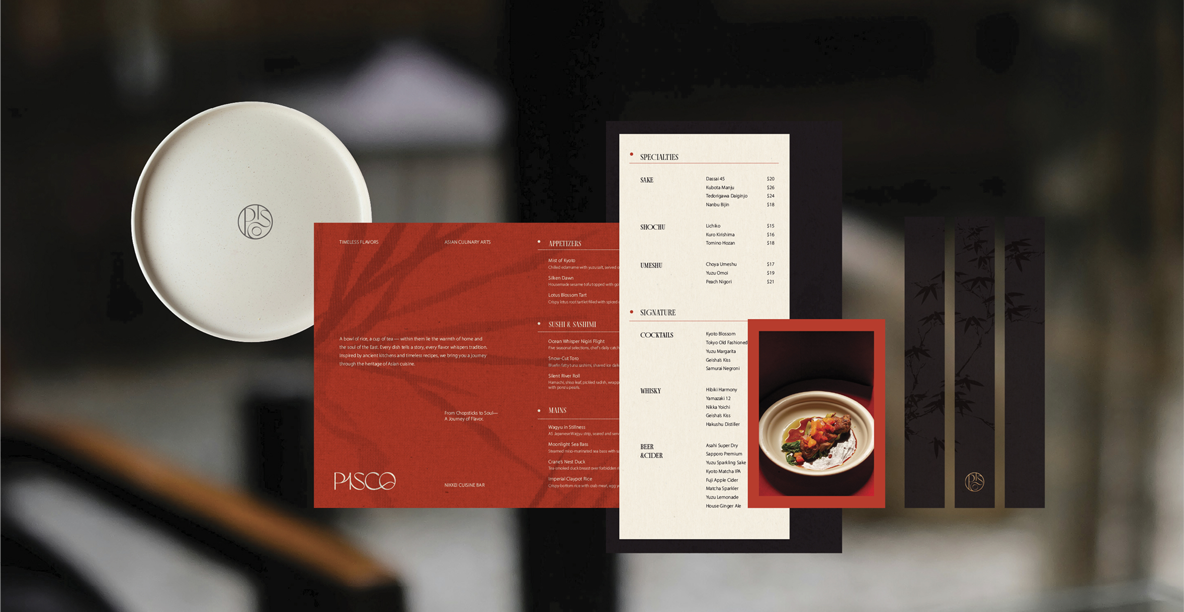
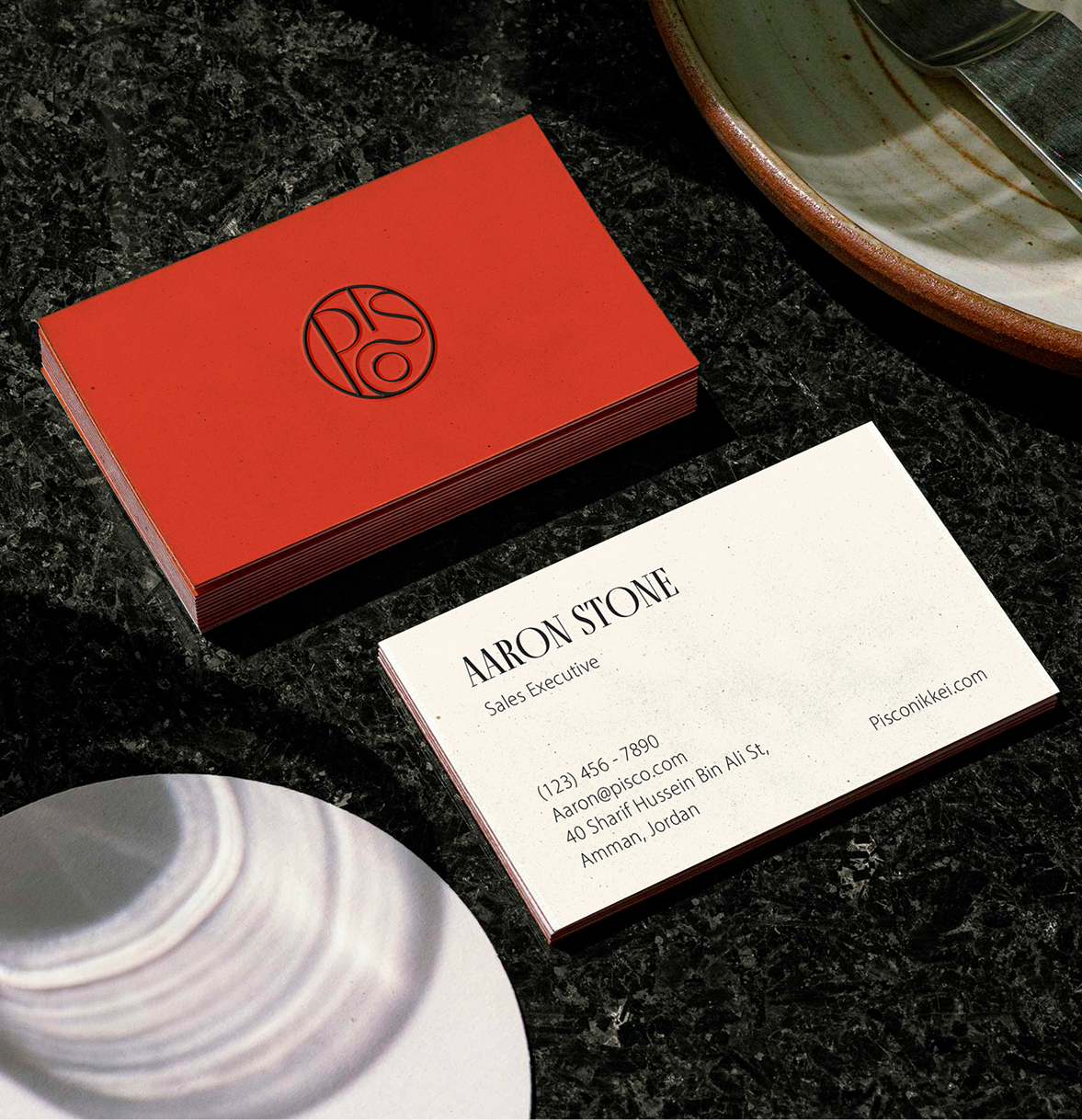
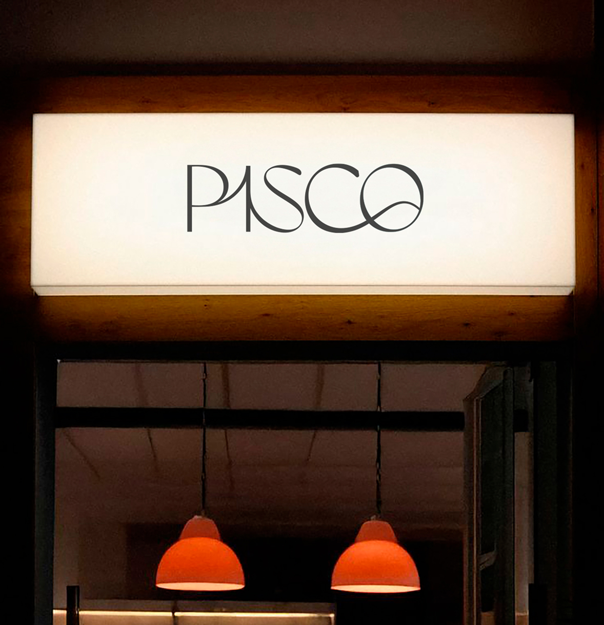
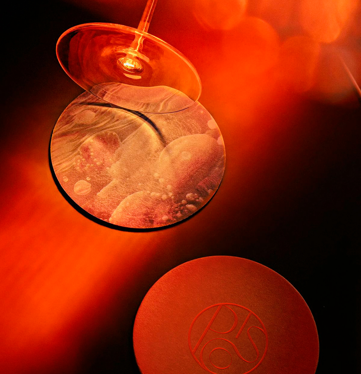
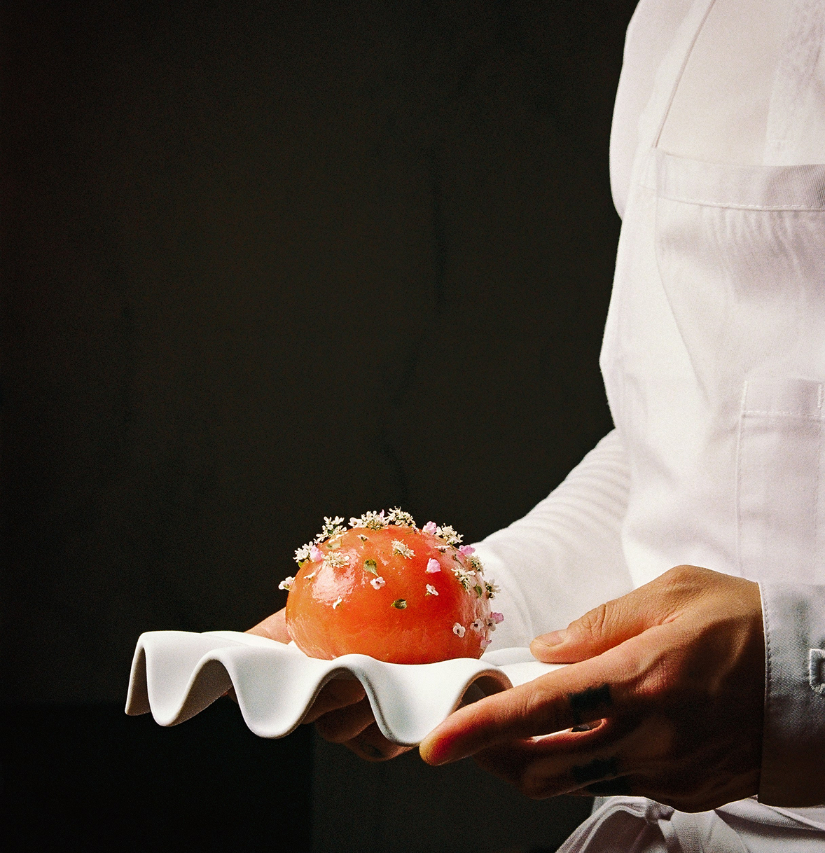
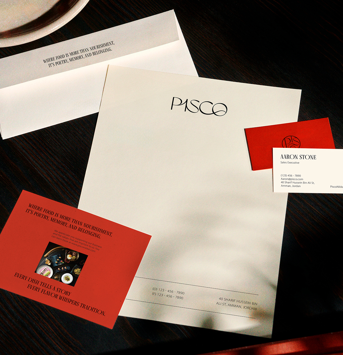
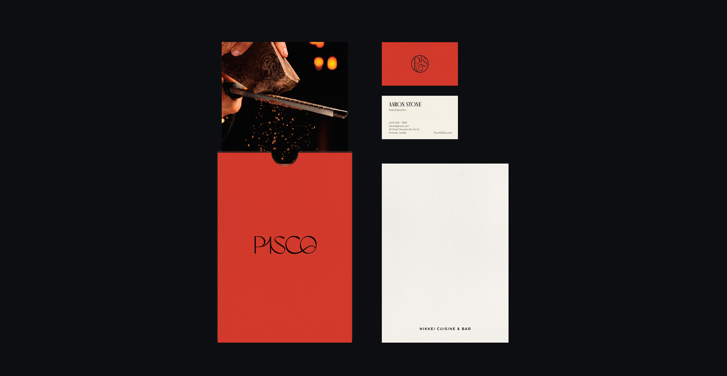
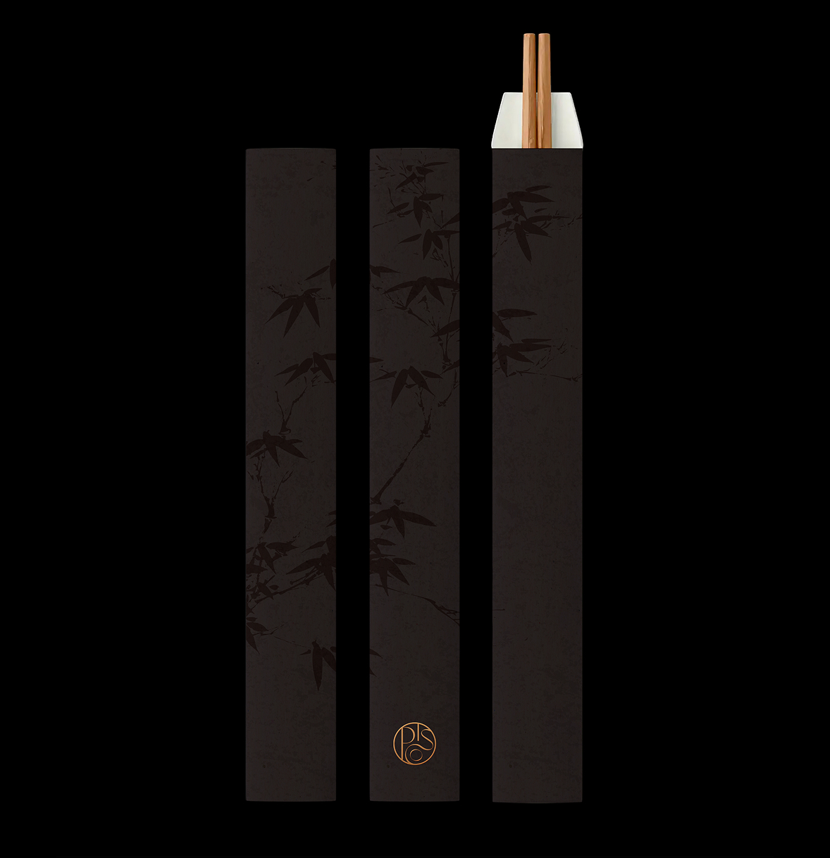
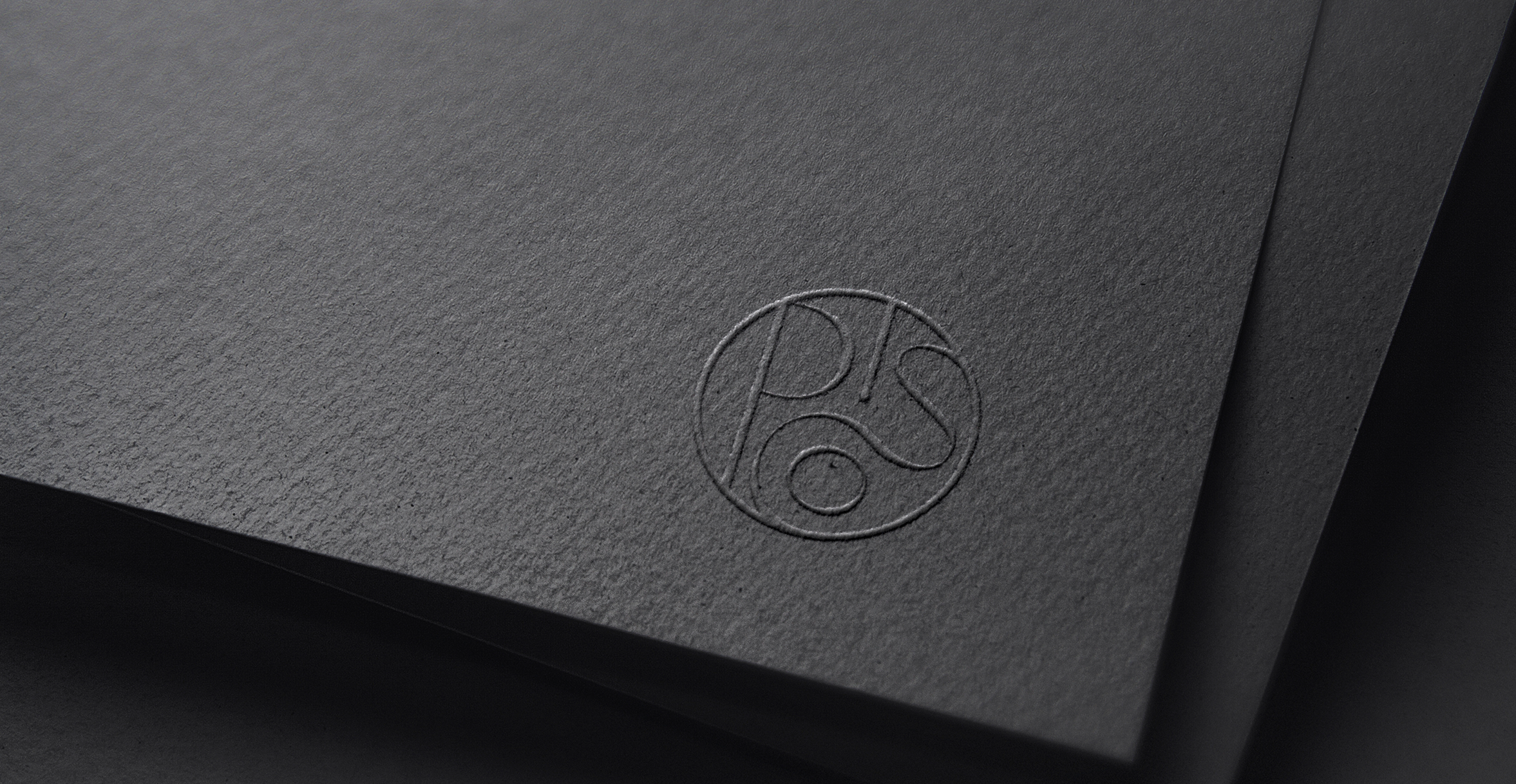
PISCO is a Nikkei cuisine bar that celebrates the art of fusion — harmonizing the delicate precision of Japanese cuisine with the expressive vibrancy of Peruvian flavors. The brand identity reflects this balance of opposites, capturing both refinement and energy through form, motion, and color. The logotype is crafted with interconnected letterforms that flow seamlessly into one another, symbolizing unity and exchange. Its circular emblem subtly recalls the Yin-Yang motif, a metaphor for harmony in contrast — representing how two distinct culinary traditions intertwine to create a singular, elevated dining experience.
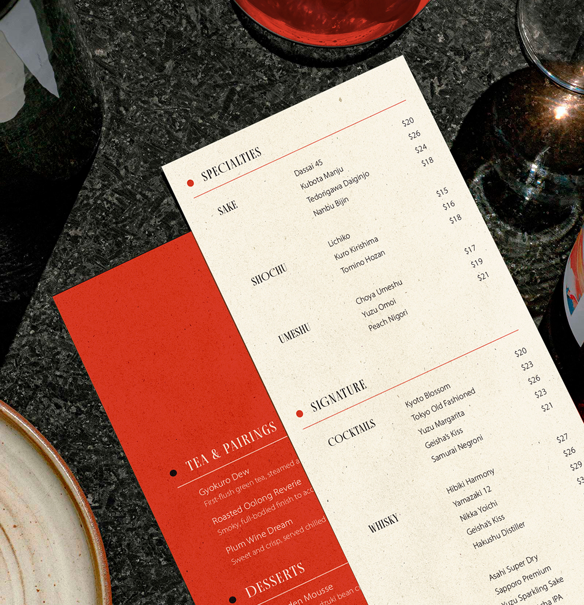
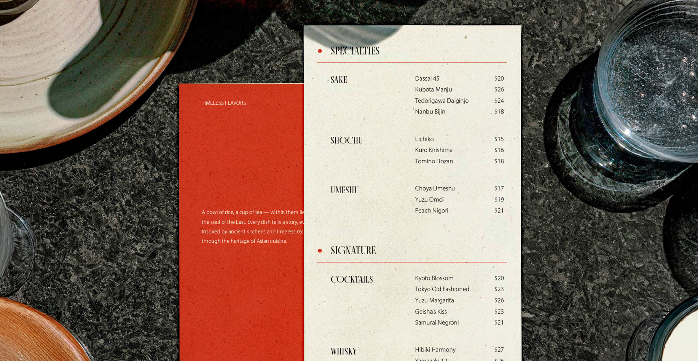
The core color palette centers on a vivid, warm red — chosen not only for its visual boldness but also for its cultural resonance. In both Japanese and Peruvian heritage, red signifies vitality, prosperity, and celebration. It conveys warmth and appetite, evoking the sensory richness of PISCO’s cuisine while creating a striking visual identity that commands attention. Paired with refined black typography and natural textures, this bright red becomes the visual heartbeat of the brand — modern, sophisticated, and deeply rooted in the shared spirit of passion and craftsmanship.
Pisco Nikkei & Bar
2025
Logo Design
Branding System
Visual Identity